Tuesday, April 20, 2010

Photo Restoration


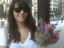
For this assignment, we had to take an original photo and restore it. I am not the best at photoshop so this assignment was challenging. I worked with the stamp tool to get rid of some of the blotches as well the scratches across the photo. I added more saturation to the photo because the original color was a little dull. I also took the bottom right corner of the photo and brightened it to match the rest of the picture. The first photo is the restored version and the bottom is the original photo.

Tuesday, April 6, 2010

Logo


This assignment was to create a logo for the title of a student magazine called Wanderer. We had to play with fonts and kerning for the best outcome. I posted four different styles. The first one is what is most commonly seen on the cover of magazines but for the type of publication we would be working on, I like the last one on the page. The "a" is a little lower than the rest of the letters, sort of a play on the word "wanderer"

Infographic Cancun


For our infographic project, I decided to place a beach photo over the box to make it a little more interesting for readers. It was a bit of a challenge to lighten portions of the picture because the contrast clashed with the text.